CNN Philippines

website case study
Project Overview
I've been with CNN Philippines for more than a year as a visual designer for their digital platform. Since CNN Philippines have already an existing website, I have started in interviewing users on how they navigate through the website. I have created a user research for CNN Philippines on how they can lessen the cost in developing. I have provided them all the necessary research to validate the design I have made.
Design Problem
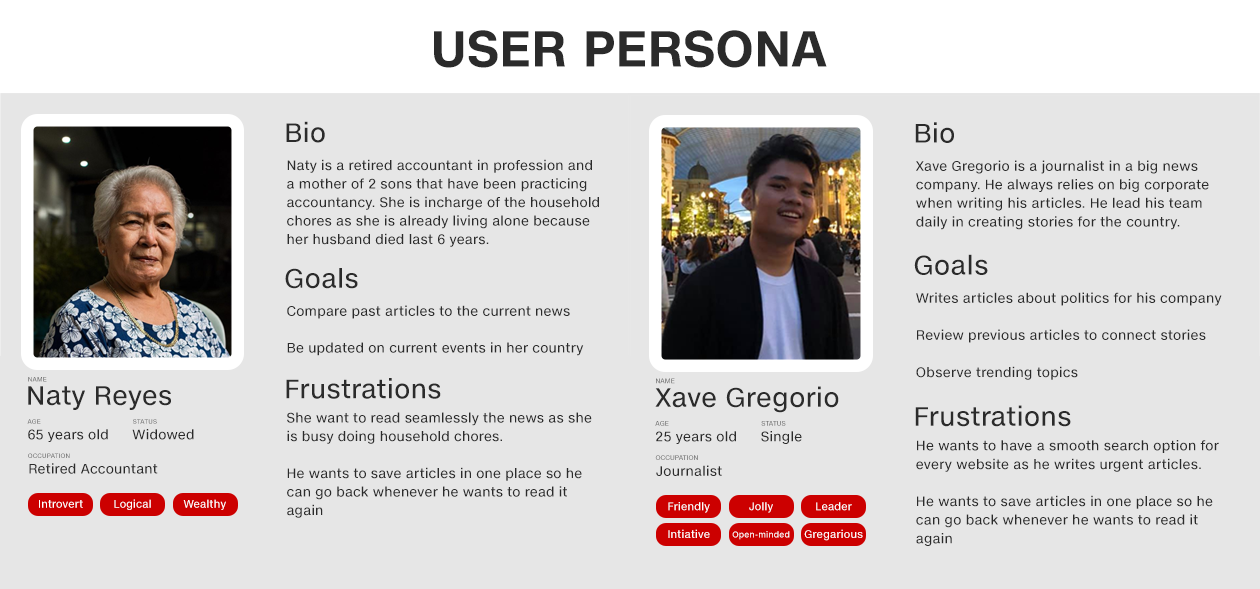
Based on my interview with our users, most of the problems they've been encountering is that they are having a hard time searching for previous articles. The other problem that occurred is that news websites have always the 'save for later' feature for their users. I've also discovered that users tend to see some items in the navigation bar as redundant and useless.
My Role
User Research
Prototyping
UI Design
Tools Used
I have created Naty Reyes and Xave Gregorio as my two representatives as I only wanted to create a user task flow for the general reading of the users.
Defining the Problem
I have created a user task flow for each persona created to that we can identify where our users struggle on a given task ang motivations. Even though that CNN Philippines was shadowing the CNN International, I've been curious if the information architecture of the website fits the ethnography of the Filipino people.
Discussing Paint Points
The pain points that stand out from the user journey map of Xave the journalist was that he washaving a hard time searching for past articles for his needs. Our opportunities regarding it are that we can improve our search bar by giving suggestions when he is searching and we can also widen our search engine. The second pain point that occurred was that he felt anxious because he had a difficult time on whether to save the link of the article because he might need it in his future writings. The paint point on Naty the casual reader states that she was having a hard time on how she can read the article some other because of her current situation. 
The pain points that standout in both in the graph are Search Bar and Save for later.

Outcomes
I have made the UI of CNN Philippines adaptable to the design trend where we can be very flexible in making changes in the future.

User's need was given based on the feedback regarding the usability tests. The user's need to read a past article using the advanced search bar was the main highlight of the usability test that I have conducted.
Learning
After pitching the case study to the company, the digital supervisor said that there have been an issue regarding the Save For Later features in terms of the rules and regulations of the CNN International.

I should have got the feedback from other while in the process so that I can adjust my design on the constraints of the company's rules.
What's next?
Since some rules and regulations have already implied by the mother company CNN International, I would like to design on how our user will find certain articles by highlighting the topic tags, and providing a wide range of search bar.

While working on the case study, I consulted my mentor and we come up that we can create a user research and ux design for each category of news since every category will be a different persona. We wanted to optimize the user experience for each group of people who are really using the product.

Collaboration with UX Designers from our mother company CNN International, would be a great help, so that we can avoid unnecessary designs that have been studied by the mother company.